Why Sensor Characterization Is So Important
The causes of erroneous raw gyroscope data and how it can be corrected
I don’t think we stop to appreciate the electronic quasi-magic that is happening all around us enough. Before starting my journey in embedded programming, to say I took for granted the inner workings of computers would be an understatement. Chief among these quasi-magical activities is the ability to turn ones and zeroes into a physical number that can be used in control systems to represent some real-world quantity.
The fact that there is a little mass measured in micrograms sitting inside a MEMS gyroscope, and that it can somehow measure angular rate, is a truly mind-boggling feat to try and wrap your head around. But despite this little mass’ best efforts, its raw output is rather unreliable, and it is the role of embedded software engineers to characterize and calibrate these sensors to make their output less erroneous.
Sensor Characterization
Sensor characterization is the process of identifying the deviation between the expected output of a sensor and its raw output, and attributing parts of this deviation to different sources of error. In a gyroscope, this process is quite simple; if a gyroscope is completely stationary, one would expect all axes to report zero motion throughout the lifespan of the program. Alas, due to the economics of engineering, creating such a perfectly calibrated gyroscope is a lost cause. As such, one can expect several factors to contribute to spurious output. Sensor characterization is not an optional step, and especially so for gyroscopes – if skipped, reported values can wander as far as 30 degrees away from the true value in minutes.
Sources of Error
In characterizing a gyroscope, we are looking to identify the following:
- Offset Bias
- Bias Repeatability
- Angular Random Walk
- Rate Random Walk
- Bias Instability
Offset Bias
This is the simplest source of error to correct for. If your gyroscope is perfectly stationary, the mean of each axis’ output should be zero. If this is not the case when your gyroscope first starts, you can simply take the mean of the raw output and subtract it from all future outputs. This is known as an offset bias, and can be corrected for with a simple subtraction.
corrected_output = raw_output - constant_biasBias Repeatability
Offset bias is not perfectly constant – it changes slightly during each run of a program, and it also changes from run to run. This run-to-run variation is called bias repeatability, and it is a measure of how much the offset bias changes each time you power on the gyroscope. To correct for this, the offset bias must be measured and subtracted every time the program starts up during a calibration phase. During this time, the gyroscope should remain perfectly stationary.
Angular Random Walk
The raw output of a gyroscope – or any sensor for that matter – is never completely steady. There is white noise which causes the reading to jitter up and down quite rapidly. This movement is mostly random. However, when you integrate angular rate to find the angle, this sum of white noise can over time cause the angle to wander. This causes your angle reading to perform a “random walk” away from the true value. By doing something called an Allan variance analysis, which will be explained momentarily, we can quantify this noise and its impact on angular random walk.
Rate Random Walk
We learned in the bias repeatability section that offset bias is not constant. While bias repeatability is a measure of the run-to-run variations, rate random walk is a measure of the in-run variations – how constant bias drifts over time. During the program’s lifespan, the offset bias, like the integrated angle, will perform a random walk. This is primarily due to environmental and complicated mechanical processes. Because of this, when you subtract the offset at the start of your program, confidence in the reading should decrease over time due to rate random walk. Also like angular random walk, rate random walk does not gravitate towards a particular value – it is random. While angular random walk is caused by white noise – rapidly-changing noise clearly visible sample-to-sample – rate random walk is caused by a much slower noise called Brownian noise, which will be explained in greater depth later. Rate random walk itself cannot be “corrected” for – it is caused by unpredictable mechanical factors – though you can mitigate it through filters.
Bias Instability
Angular random walk is helped by averaging – by taking the mean of increasingly large groups of samples and comparing to adjacent groups, the difference between them shrinks as white noise gets averaged away. Rate random walk is hurt by averaging – by continuing to average even larger groups, the difference between them begins to grow larger as Brownian noise in the form of environmental and mechanical factors begin to show up in your averages. In between these two, there is a region where averaging larger samples neither helps nor hurts – the noise between them is identical. This is the period of bias instability, which is where flicker noise lives. It is a type of noise that sits between white and Brownian and can never be completely averaged away. This will be explained further after the Allan variance, where it will make more sense.
Allan Variance
Imagine a six-hour sample of raw, perfectly stationary gyroscope data collected at a rate of 100 Hz – one sample every 10 milliseconds. We want to identify two things – how the readings change in the short term, and how the readings change in the long term.
To do this, we can start by splitting the data into groups of 50ms and averaging their values. At this point, the data is quite volatile – with only 5 readings per group, white noise heavily affects the readings. If we were to compare one group to its neighbors, it is likely that they are quite different.
So, let’s add more data to our buckets by increasing the size to 10s. At this point, white noise has a much smaller effect on our average. Now if we compare adjacent groups, they are likely much closer in value as the effect of white noise effectively gets “averaged out”. If you were to imagine this as a graph, you could reason that as the size of our groups increase, the deviation between adjacent groups must decrease.
However, there comes a point where making our groups larger no longer impacts the deviation between adjacent pairs at all. We are at a point where the groups are sized such that the white noise is no longer visible in our readings. Going back to our graph, we can imagine that it is now flat – as the size of our groups increase, the deviation between adjacent groups is now constant.
But let’s take it one step further. Let’s make our groups very large – say, 3000s. At this point, certainly we have no white noise. But now we have a different concern – our offset bias has begun to drift between our groups. This is the period of rate random walk, and now we can imagine the graph going back up – as we continue to increase the size of our groups, the deviation between adjacent groups begins to increase.
This is an Allan deviation plot, and it looks like this:
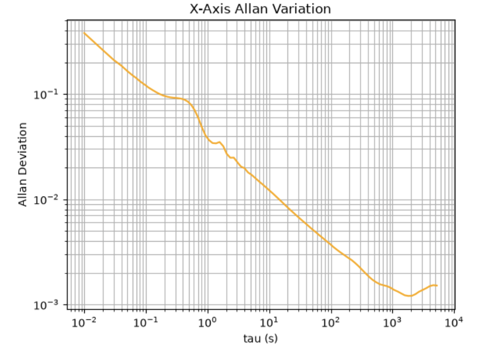
This is a graph I produced after recording raw data from my gyroscope overnight. Looking at the graph, we can see some familiar things. On the left, we can see the y-axis is labeled “Allan Deviation” – this is the root mean square of differences of all adjacent pairs, scaled by 1/√2. Put simply, it is a measure of how much, on average, adjacent pairs differ. On the bottom along the x-axis, we can see the label “tau”, measured in seconds. This is the size of the buckets that we continued to adjust. And by looking at the shape of the graph, we can see exactly what was described – a downward slope as bucket size increases, followed by a flat period (or, in this case, a minimum) of the graph, and finally a rebound of the graph where deviation starts to climb once again.
The downward slope on the left is the period of angular random walk – the values of tau in which white noise dominates the integrated angle. Since white noise is rapidly changing, averaging it out with larger values of tau is very effective.
The upward slope on the right is the period of rate random walk. Remember how rate random walk is primarily a measure of environmental and mechanical change – that is not a quick process. Thus, as we make tau sufficiently large, we can actually see the adjacent groups start to drift further apart again. This is because each group is now so large that they have different biases.
The minimum of the graph is the period of bias instability. It is the period in between angular random walk and rate random walk. Tau is big enough that you can no longer see the angular random walk (though, importantly, it is still there), but not so large that we are now seeing rate random walk. This is the exact point where the marginal benefit of averaging equals the marginal cost of averaging, to think about it economically.
I found bias instability the hardest of the bunch to understand, so to explain it better, I want to walk through the actual underlying noise theory. Ultimately, angular random walk, rate random walk, and bias instability are all a result of noise in the raw gyroscope output, though there are different types of noise, each responsible for a different source of error.
White noise is the easy one; it moves up and down rapidly and it becomes visible with smaller averages – this is the noise responsible for angular random walk. Brownian noise moves up and down very slow, and it becomes visible with larger averages – this is the noise responsible for rate random walk. In the middle is flicker noise. This is the noise responsible for bias instability.
All three types of noise are present at every frequency, though they only become visible at certain average sizes. White noise gets averaged away when you take longer averages. Brownian noise stays hidden if you take shorter averages (though it is still there, just not yet visible). And since flicker noise is in the middle, you will always have some that is too fast to average away, and some too slow that hasn’t shown up yet. This explains why bias instability is a flat line - no matter how much you adjust the average size, you remove exactly as much noise as you reveal.
By looking at this Allan deviation plot, we can identify the constant N (angular random walk) at tau = 1, K (rate random walk) at tau = 3, and B (bias instability) at the minimum (and divided by a constant, 0.664). These are constants that can be plugged into a filter to quantify how much noise is present in the gyroscope.
With these constants, it is possible to tell a filter how much to trust a gyroscope. N describes how noisy any single reading is, K describes how quickly the startup calibration goes stale, and B describes the accuracy floor of the gyroscope. They let a Kalman filter weigh the gyro against other sensors instead of guessing.
Controlling this little vibrating mass starts with knowing exactly how much to believe it – and that is what sensor characterization is for.